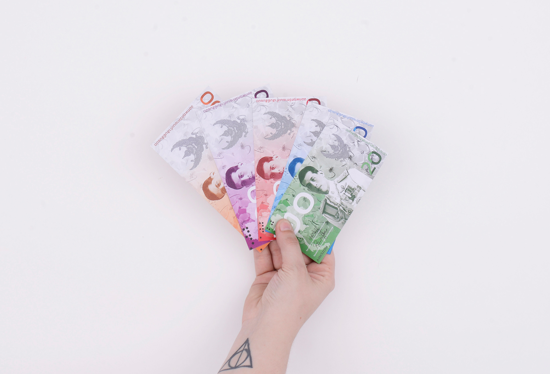
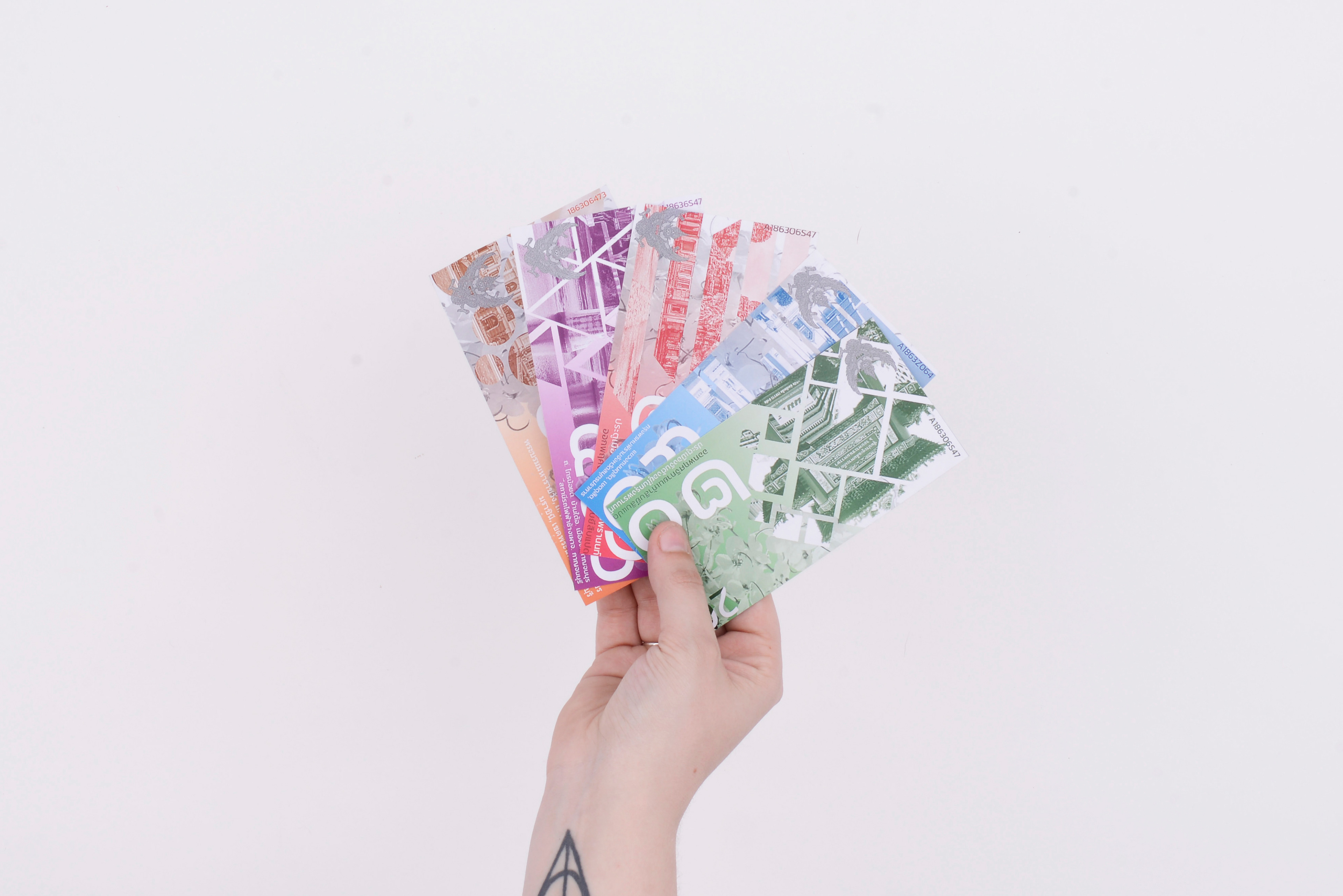
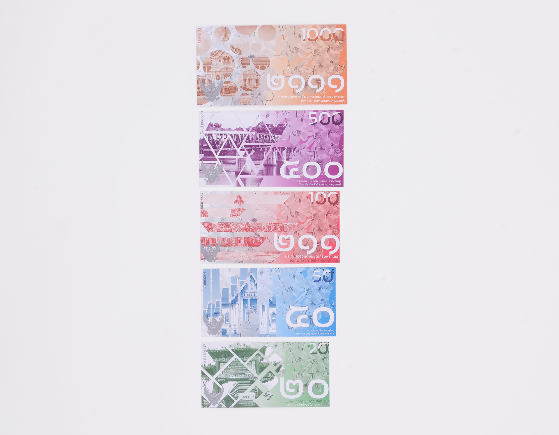
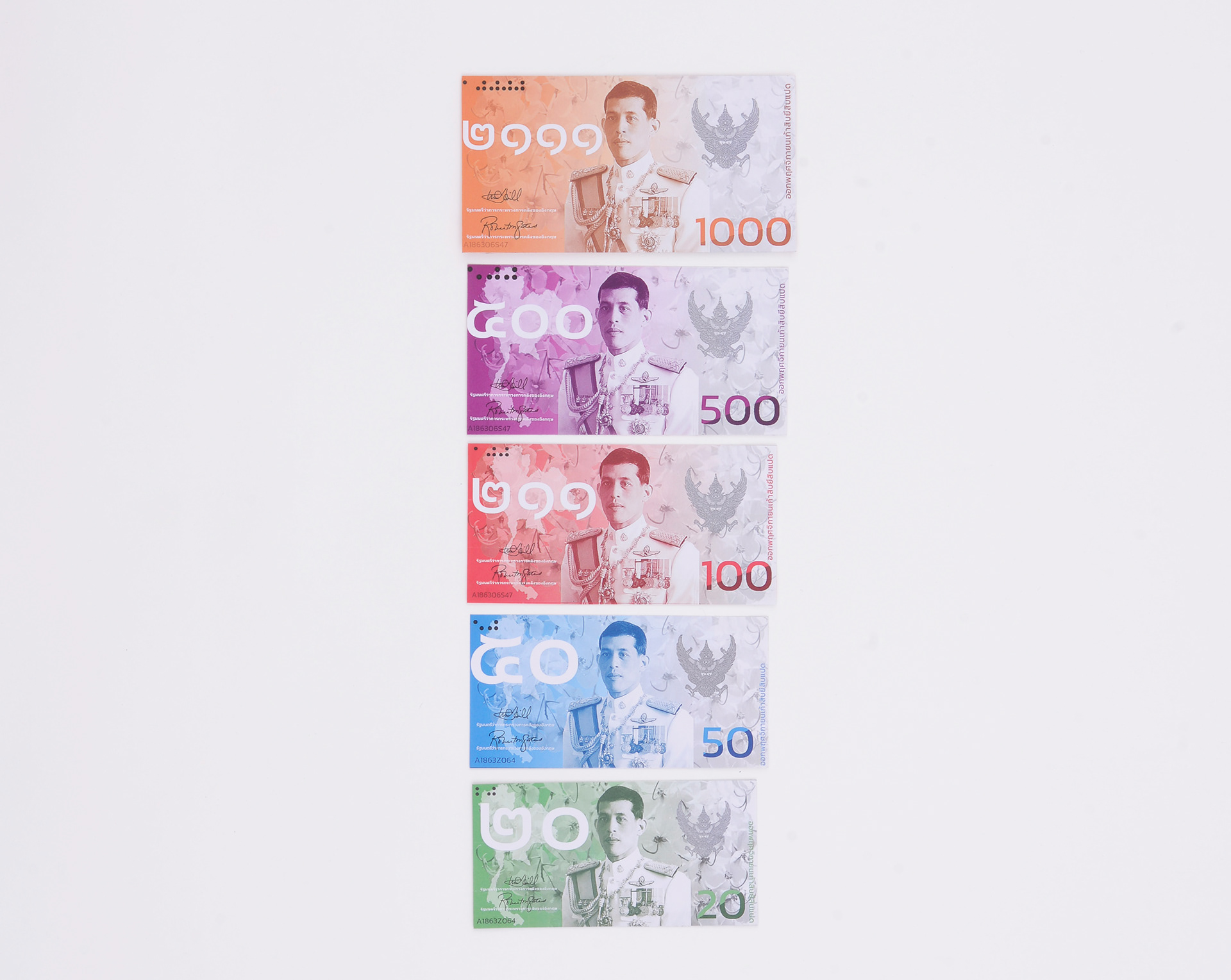
My bank notes are designed to help the visually impaired in Thailand. The sizes of the notes go up a few millimetres (in both width &height) with each note so they are easily identified by hand. The images on the notes were chosen to coincide with the size denominations on the notes as the bigger the building, the larger the note, and the shapes were chosen as they are shapes that are seen within Thai architecture.
The idea to use the shapes found within the architecture is there to help the visually impaired as those with colour blindness will still be able to distinguish the shapes even if they cannot distinguish the colours used. Braille was added to the top corners to help the blind use the notes more effectively. Some of the colours of the bank notes were changed to either a different colour or shade as to distinguish them all from each other.